FIGURE 1. Examples of functional crown type scores, each row presents a set of teeth with different occlusal topography. Tooth sizes are not to scale. 1, Diceros ; 2, Listriodon ; 3, Giraffa ; 4, Pan ; 5, Megaladapis ; 6, Kobus ; 7, Hippotragus ; 8, Hippopotamus ; 9, Hylochoerus ; 10, Ceratotherium ; 11, Loxodonta ; 12, Bos ; 13, Equus ; and 14, Phacochoerus . The figure has been adapted from Zliobaite et al. (2016). Sources of the illustrations: Diceros and Ceratotherium are from figure 2 in Fortelius (1981), Kobus and Hyppotragus are from figure 2 in Kaiser et al. (2010), all the other examples come from several illustrations in Thenius (1989).
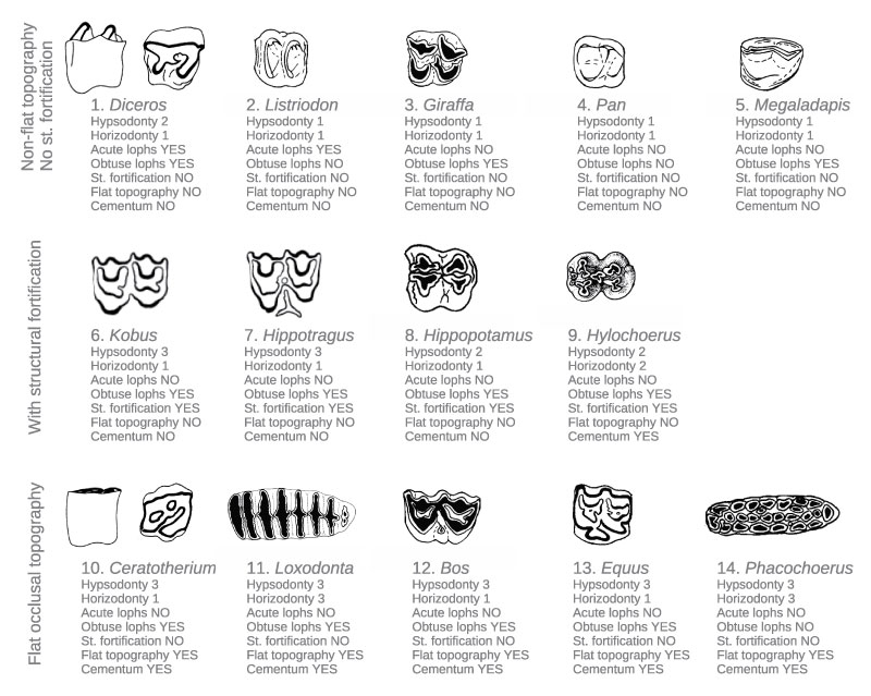
FIGURE 2. Datasets, data aggregation and mining processes. The initial datasets (Sites × Taxa) and (Taxa × Traits) are aggregated to produce the (Sites × Traits) dataset. Redescriptions are then mined from this dataset and the (Sites × Climate) dataset, resulting in a collection of redescriptions denoted as R1, R2, etc.
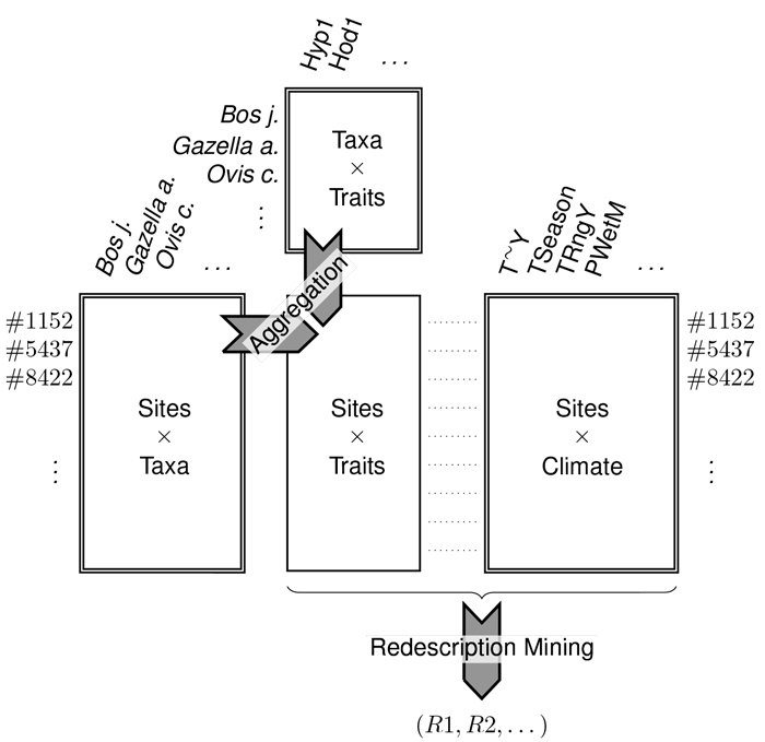
FIGURE 3. Maps of global dental trait distributions. Each site is represented as a colored square on the map. Next to each plot, a colorbar indicates the mapping from colors to traits values (right side of the legend) and a histogram depicts the distribution of those values (left side of the legend).
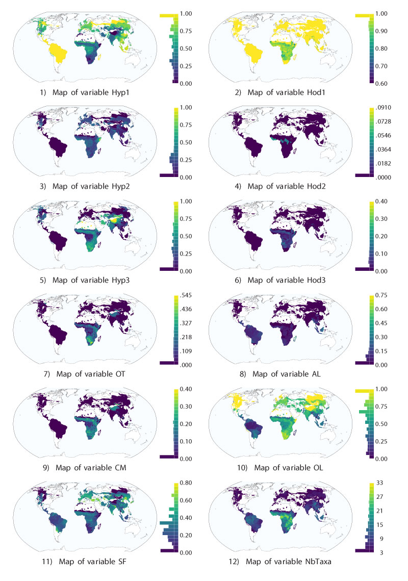
FIGURE 4. Maps of bioclimatic variables: temperatures. Each site is represented as a colored square on the map. Next to each plot, a colorbar indicates the mapping from colors to the values of the temperature variables (right side of the legend) and a histogram depicts the distribution of those values (left side of the legend).
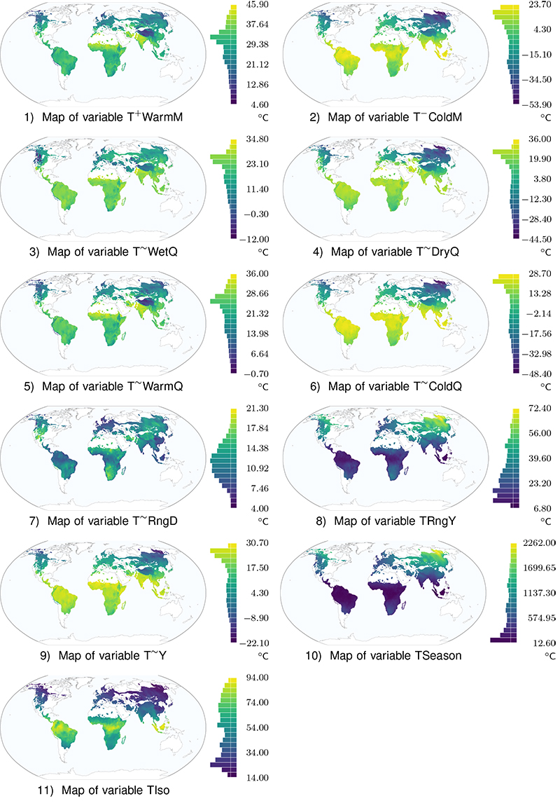
FIGURE 5. Maps of bioclimatic variables: precipitation. Each site is represented as a colored square on the map. Next to each plot, a colorbar indicates the mapping from colors to the values of the precipitation variables (right side of the legend) and a histogram depicts the distribution of those values (left side of the legend).
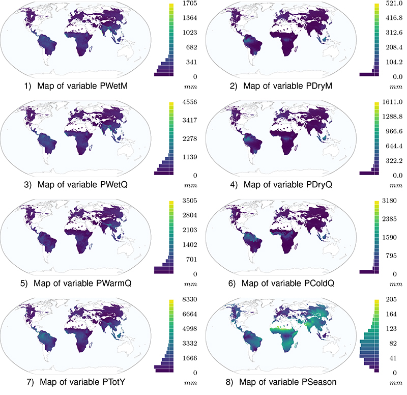
FIGURE 6. Maps of redescriptions R1 to R9. Locations that satisfy both queries of the redescription are plotted in dark purple (darkest shade of gray), locations that satisfy only the dental traits query and only the climate query are plotted in red and blue, respectively (intermediate shades of gray), while locations that satisfy neither queries are plotted in light gray.
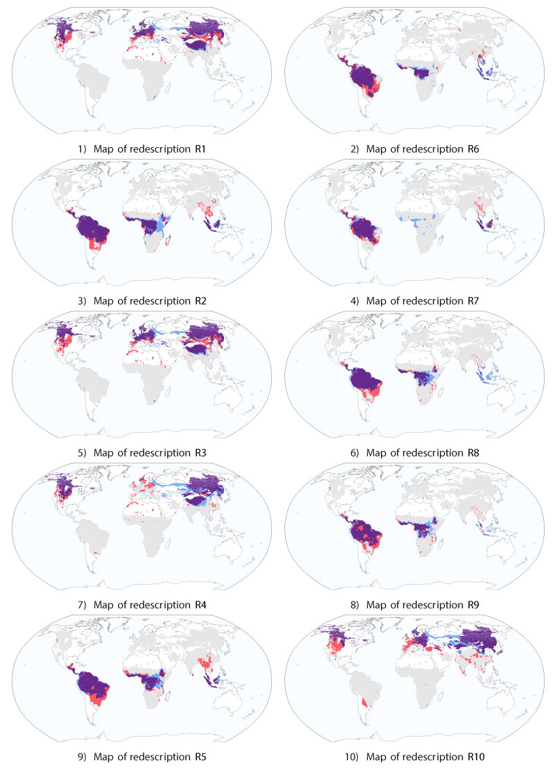
FIGURE 7. Maps of redescriptions R1 and its variants. Locations that satisfy both queries of the redescription are plotted in dark purple (darkest shade of gray), locations that satisfy only the dental traits query and only the climate query are plotted in red and blue, respectively (intermediate shades of gray), while locations that satisfy neither queries are plotted in light gray.
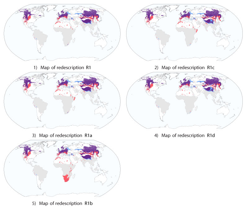
FIGURE 8. Maps of redescriptions R2, R5 and variants. Locations that satisfy both queries of the redescription are plotted in dark purple (darkest shade of gray), locations that satisfy only the dental traits query and only the climate query are plotted in red and blue, respectively (intermediate shades of gray), while locations that satisfy neither queries are plotted in light gray.
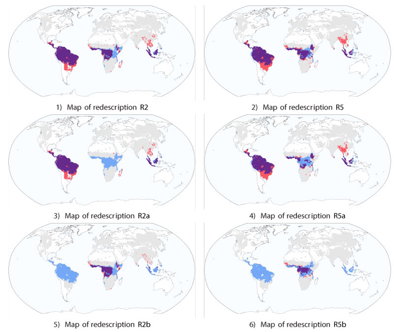
FIGURE 9. Maps of redescriptions R43, R69, R74 and variants. Locations that satisfy both queries of the redescription are plotted in dark purple (darkest shade of gray), locations that satisfy only the dental traits query and only the climate query are plotted in red and blue, respectively (intermediate shades of gray), while locations that satisfy neither queries are plotted in light gray.
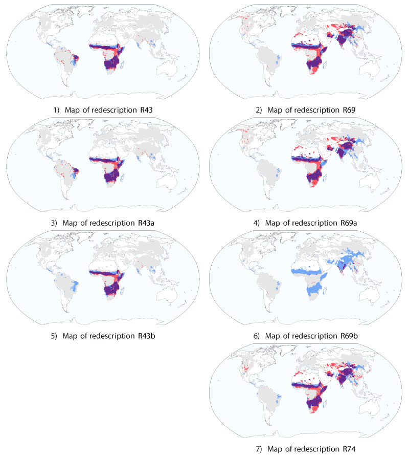
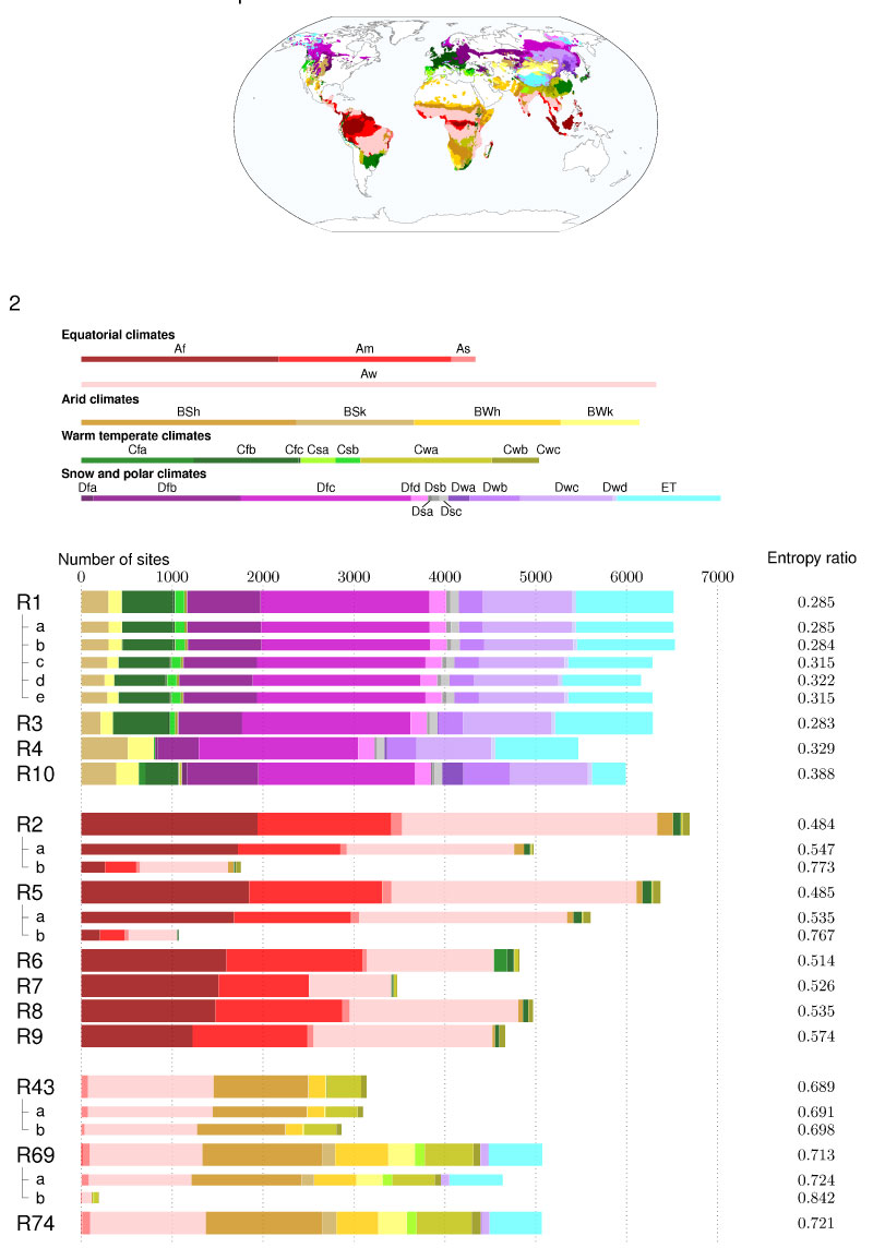
FIGURE 10. Figures comparing the supports of the redescriptions to the Köppen-Geiger climate classification system. 1, Map of the distribution the Köppen climate subclasses in our dataset. 2, Histograms showing the distribution of the support of the redescriptions over those subclasses and entropy ratio evaluating the match between the support and the subclasses.