|
|
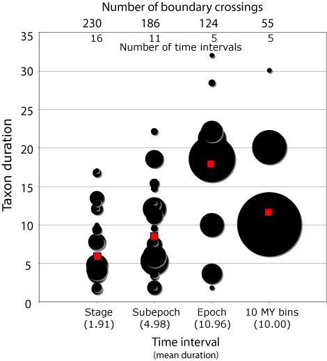
Figure 5. Bubble chart showing the effects of interval size on the perception of taxon longevity. The bubbles on the chart are centered on the duration of cetacean genera, and the size of the bubbles is proportional to the number of taxa having that duration. The red squares show the mean duration for each time scale. The numbers across the top indicate the number of boundary crossings from one time interval to the next. The mean duration of the time intervals is also shown across the bottom. Note that at the finest scales, the mean durations are not dramatically different. The epoch scale shows an interesting elevation in taxon duration, which is caused by a large number of genera that cross from the late Miocene into the early Pliocene. This pattern is not shown in the 10 million year bin scale because this group of taxa is broken up in that scale. Also note that the number of boundary crossings decreases as the number of time intervals decreases, as one might expect.
|