|
|
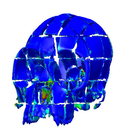
Figure 7. The color map plot of average distance calculations between the reconstruction trial in Figure 5 and the deformed template. Blue represents good fits while red represents bad fits.
|
|
|
Figure 7. The color map plot of average distance calculations between the reconstruction trial in Figure 5 and the deformed template. Blue represents good fits while red represents bad fits.
|