|
|
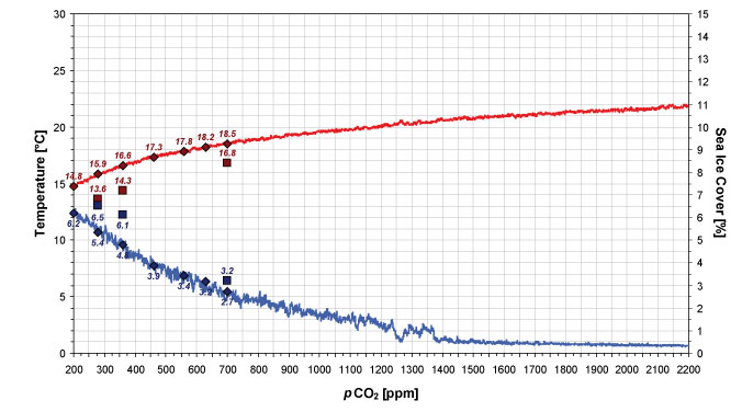
FIGURE 4. The global averages of temperature [°C] (red, left axis) and sea ice cover [%] (blue, right axis) plotted against the atmospheric CO2 concentration [ppm]. The red and blue lines represent TORT-INC, diamonds illustrate TORT-200 to TORT-700, and squares show CTRL-280, CTRL-360, and CTRL-700.
|