FIGURE 1. Map of the northwest coast of Western Australia showing the relation between the Montebello and Barrow Islands and Cape Range peninsula.
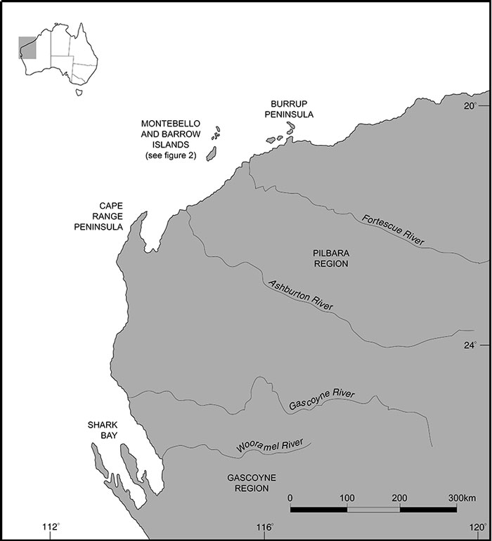
FIGURE 2. A close-up map of Barrow and Montebello Islands, showing bathymetry of the area around the islands. The 10 m isohyet shows the outline of the “super-island”, created when sea levels cut off the islands from the mainland and discussed below.
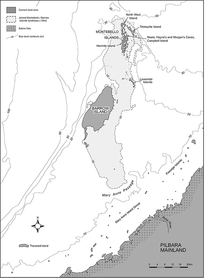
FIGURE 3. Google Earth© (2020) image of Campbell Island within the Montebello Island group.
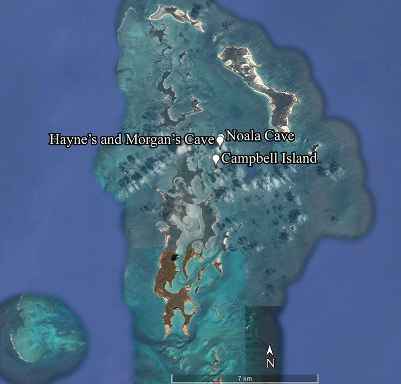
FIGURE 4. Google Earth© (2020) image showing approximate positions of the three caves on the peninsula surveyed by Veth.
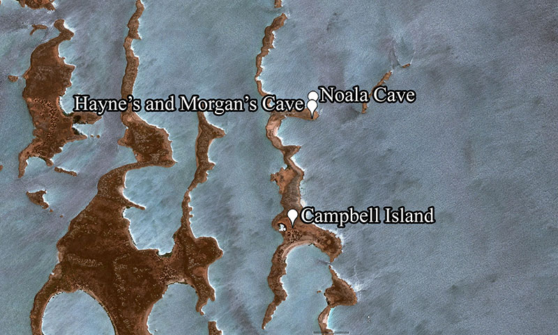
FIGURE 5. Rarefaction Curves for each of the seven spits in Morgan’s Cave.
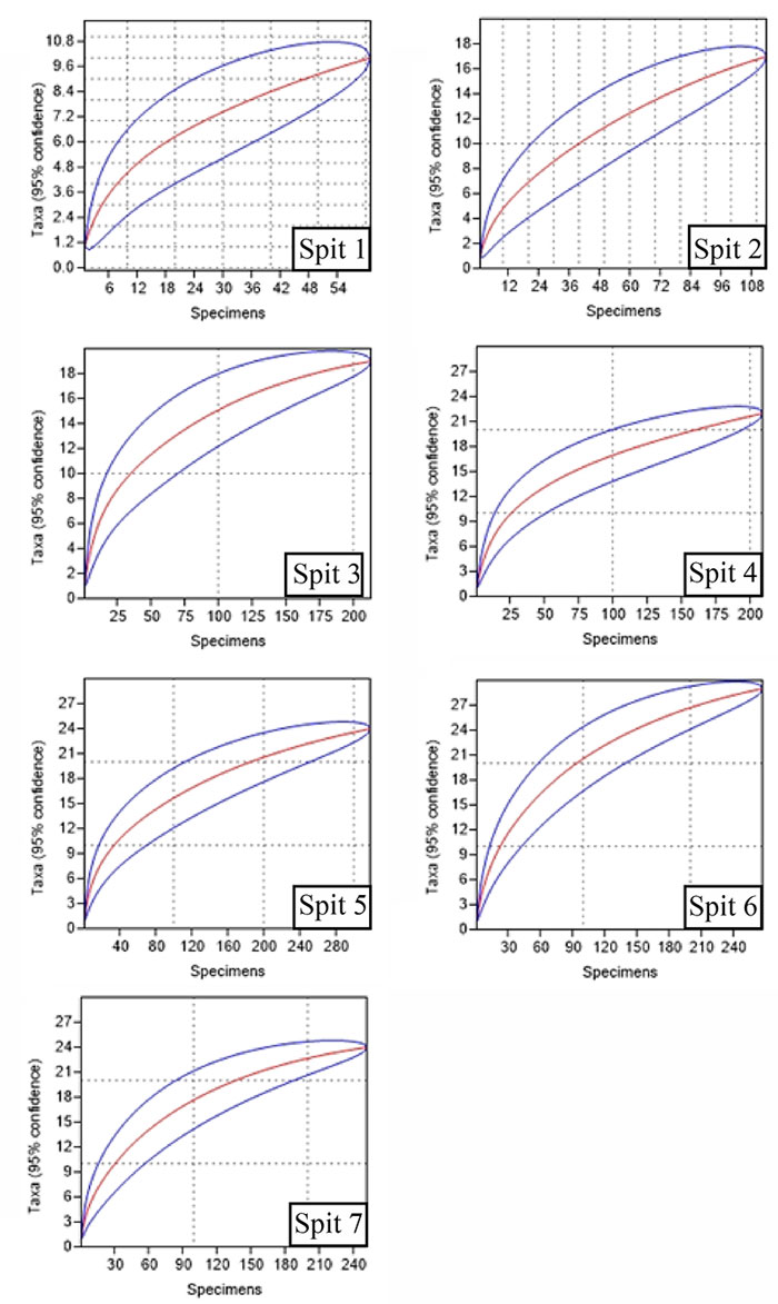
FIGURE 6. Species accumulation curve for Morgan’s Cave, showing increasing species with increased sampling effort (cumulative NISP). Further sampling effort could have yielded more species.
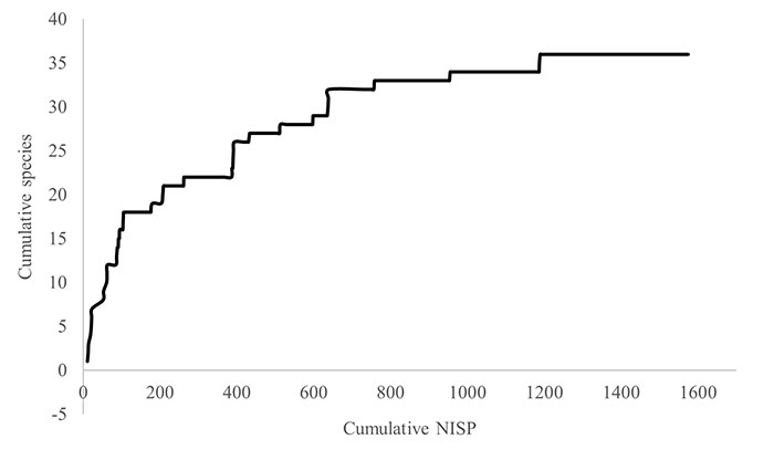
FIGURE 7. Spindle plot of the relative abundances of the species present in three or more spits in the Morgan’s Cave deposit, plus all the species recorded in the Barrow Island owl pellet sample, showing the decrease in abundance of sand plain specialists such as Notomys alexis, and the increase in non-sand plain specialists such as Pseudomys nanus.
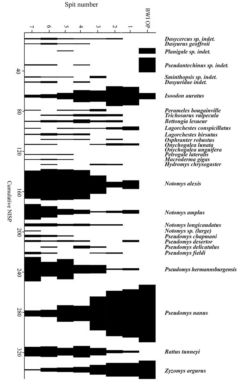
FIGURE 8. Log non-volant species vs log area plot for the north-west islands (filled circles) and the super-island at sea level 10 m below present (open circle).
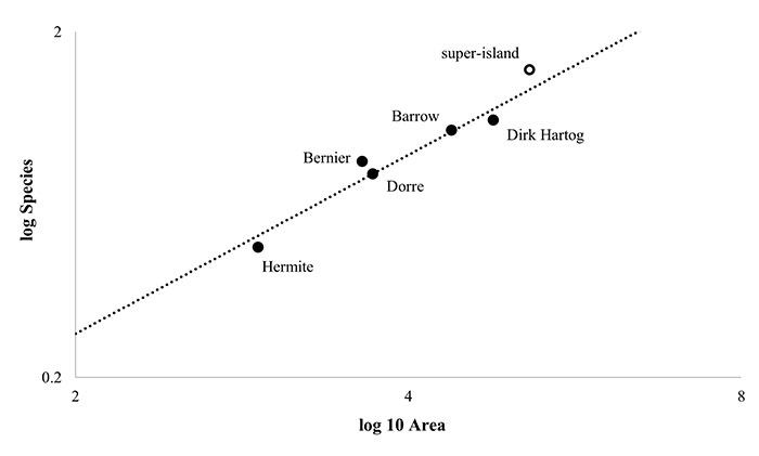
FIGURE 9. Species-area plot for islands on the north-west continental shelf (filled circles) (data from Abbott and Burbidge, 1995), and spits one to seven in Morgan’s Cave (open circles).
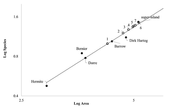
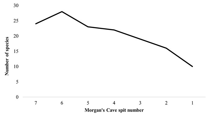
FIGURE 10. Number of species identified from each spit in Morgan’s Cave, illustrating the increasing loss of species from spits four to one.