FIGURE 1. The experimental setup. 1.1 Picture of the water tank containing the burrowing environment. 1.2 Scheme of the setup. Shell models were placed at an initial position touching the sediment surface and then pulled in by two linear motors mounted vertically at the outside of the tank. The force was transmitted to the shell by two steel cables deviated by pulleys. By alternately pulling, the linear motors induced the typical rocking motion employed by burrowing bivalves. 1.3 Central metal disc and two 3D printed valves, outer and inner side. The valves were fixed to the metal disc by a bayonet coupling mechanism. The cables were attached to the shell at the two attachment arms of the metal disc. 1.4 Assembled shell. Pictures 1.1, 1.3 and 1.4 reprinted from Germann and Carbajal (2013). © IOP Publishing. Reproduced by permission of IOP Publishing. All rights reserved.
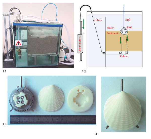
FIGURE 2. Geometrical model to generate artificial shell morphologies. 2.1 Illustration of the generation of a shell mesh, with n = 10 segments (black, dashed) and m = 10 growth steps (red, solid). The aperture curve was repeatedly scaled and rotated around axis d to generate the shell surface. 2.2 The sculpture profiles δr and δc used to generate radial (top) and commarginal ridges (bottom, ventral to the right). 2.3 Aperture curve of a shell (individual 6 in Figure 8), generated from parameters 1-8 in Table 1. The parameters define the polar coordinates of five points c1-c5 in the plane that span a control polygon (black) and define a NURBS curve (red). The aperture curve consists of a discretization of this curve into n points as in 2.1. The red arc denotes the position of the umbo and point A the position of the incircle of the aperture curve, where the attachment structure was placed (see text).
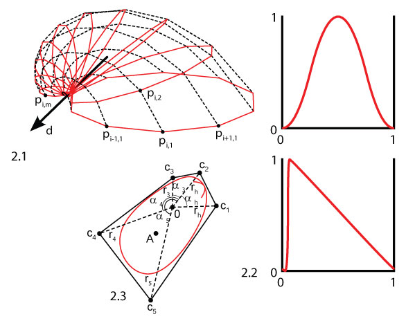
FIGURE 3. Example shell morphologies: 3.1 neutral, with a round aperture curve, intermediate values for all parameters and no sculpture (a = 0), 3.2 long aperture curve, 3.3 high aperture curve, 3.4 flat, with λ = 1.02069, 3.5 inflated, with λ = 1.00339, 3.6 featuring an ear, using an aperture curve with a large indentation, 3.7 with maximal commarginal frequency, 3.8 with medium commarginal frequency, 3.9 with minimal commarginal frequency, 3.10 with maximal radial frequency, 3.11 with medium radial frequency, 3.12 with minimal radial frequency, 3.13 with a radial-commarginal mixture, 3.14 featuring a sharp arrow shape, 3.15 with an arbitrary shape. Note that the scale is not the same for all shells.
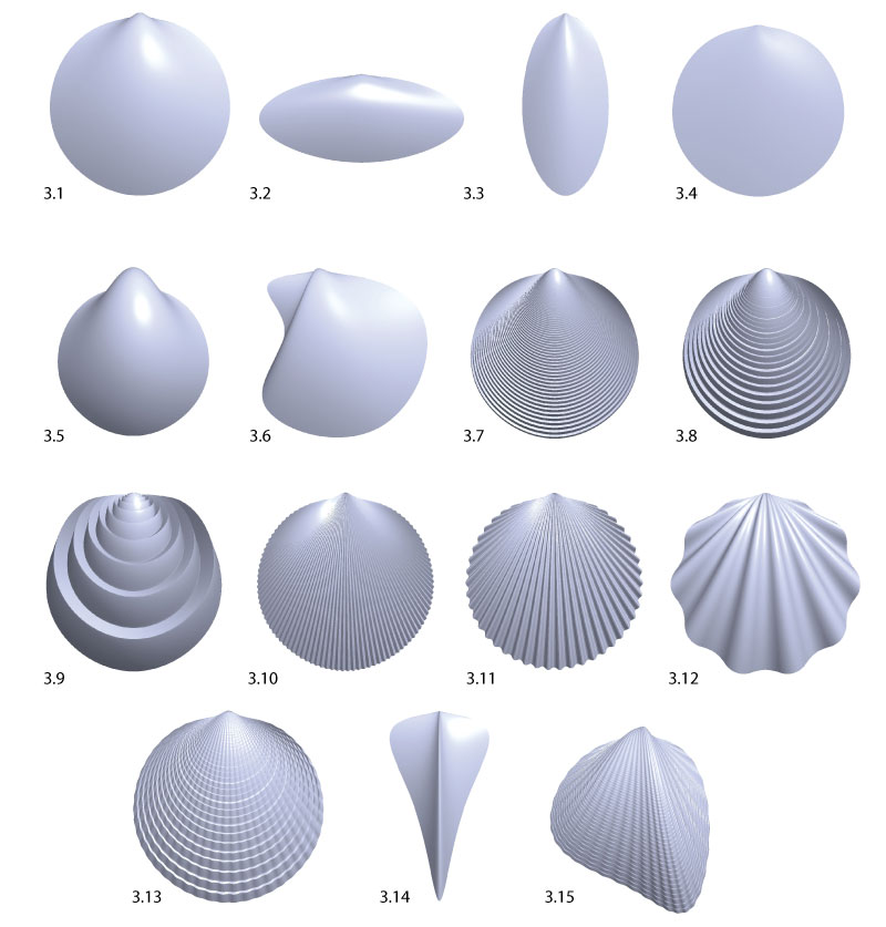
FIGURE 4. Different shell dimensions. While the width W is always defined as the dimension orthogonal to the aperture plane, the other two dimensions may be defined in different ways, cf. Table 2. The burrowing direction is downwards. 4.1 Length L and height H. Length is parallel to the hinge axis. 4.2 Tallness T and broadness B. Tallness is parallel to the burrowing direction, i.e., vertical. 4.3 Major axis length J and minor axis length N. J is along the largest diameter of the shell.
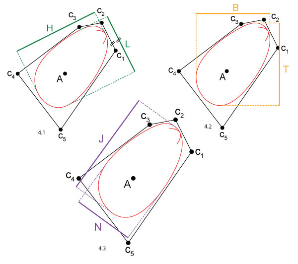
FIGURE 5. Burrowing depth boxplot. 20 generations of shells were generated. In each generation, the three new shells were evaluated and the two parents of the previous generation were re-evaluated (red labels). Each evaluation of a shell consisted of 10 repeated burrowing runs of which the final burrowing depths were measured. One box in the plot summarizes these 10 repetitions. The labels of the x-axis give the generation number (1-20) and the shell number (1-60).
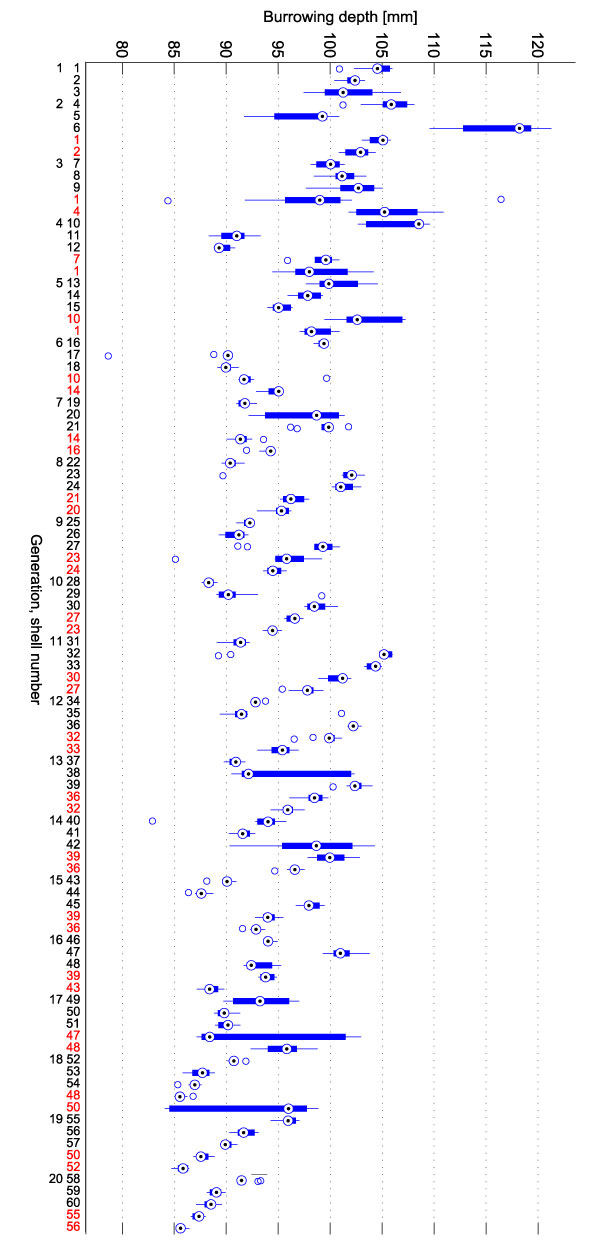
FIGURE 6. Depth correction. 6.1 Original depth data (blue, corresponds to the sequence of medians shown in Figure 5). The repeated evaluations are marked by red circles and connected by dashed lines. 6.2 Shift 1: depth data shifted such that repetitions match under the assumption that compaction is irreversible. 6.3 Shift 2: depth data shifted such that repetitions match and the final depth curve has a horizontal regression line. 6.4 The shift vectors shift 1 and shift 2 added to the original data to generate the corrected versions in 6.2 and 6.3.
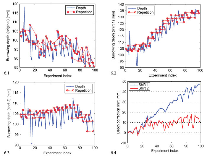
FIGURE 7. Fitness and mutation rate. 7.1 The plot shows the range of fitness values for each generation. The solid line follows the best individual of each generation. The dark shaded area covers the best two individuals, i.e., the selected ones, the bright shaded area covers all individuals. The original data is compared to two versions corrected in analogy to the depth values in Figure 6. 7.2 The same kind of range evolution plot for the mutation rate.
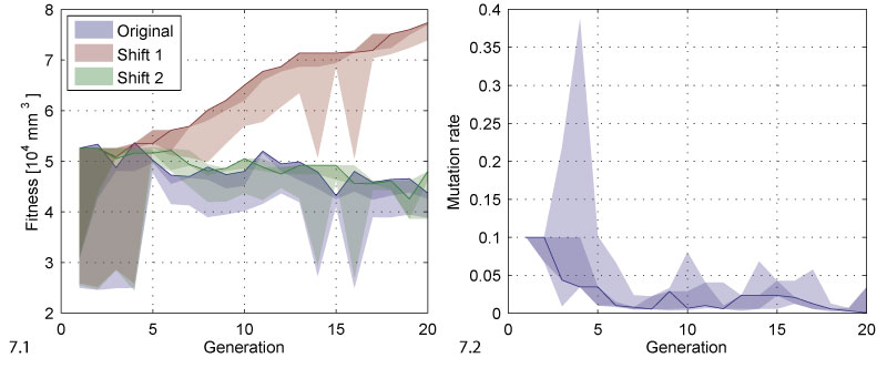
FIGURE 8. Phylogenetic tree. Each row corresponds to a generation. A generation contains three new individuals generated by reproduction and two re-evaluated individuals selected in the last generation. As reproduction operators, mutation (red dotted lines) and crossover + mutation (blue dashed lines) were used.
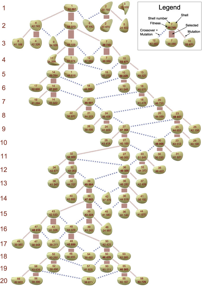
FIGURE 9. Parameter range evolution. The plots show how the parameters changed during evolution. The solid line follows the best individual, the dark shaded area covers the selected individuals, the bright shaded area covers all individuals. The red dots represent shells that were generated but discarded because they were invalid, i.e., because they did not result in printable shell morphologies. The range of the y-axis corresponds to the range of the respective parameter.
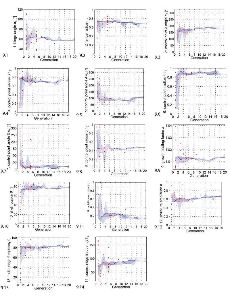
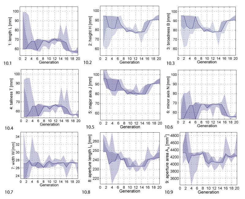
FIGURE 10. Phenotypic parameter range evolution. The plots show how the phenotypic parameters changed during evolution. The solid line follows the best individual, the dark shaded area covers the selected individuals, the bright shaded area covers all individuals.