RESULTS
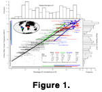 Exploring the relationship between a single pair of variables is simple and intuitive. For instance, as is well-known, a plot of the percentage of untoothed leaves (P) against MAT shows a strong linear relationship.
Figure 1 shows this relationship by plotting all available CLAMP data along with associated least-squares regression lines. The regression line for all the data is shown as a dotted line and limiting the regression to the floras for which information is available on the total number of species coded does not change the line perceptibly. The points are colored to show which study they came from and the thicker, colored lines show the results that are obtained when separate regressions are performed for each study. These regression lines are cropped to the extreme ranges of each data set, which are shown by colored bars near the edges of the plot.
Exploring the relationship between a single pair of variables is simple and intuitive. For instance, as is well-known, a plot of the percentage of untoothed leaves (P) against MAT shows a strong linear relationship.
Figure 1 shows this relationship by plotting all available CLAMP data along with associated least-squares regression lines. The regression line for all the data is shown as a dotted line and limiting the regression to the floras for which information is available on the total number of species coded does not change the line perceptibly. The points are colored to show which study they came from and the thicker, colored lines show the results that are obtained when separate regressions are performed for each study. These regression lines are cropped to the extreme ranges of each data set, which are shown by colored bars near the edges of the plot.
Above and to the right of the main bivariate plot are histograms showing the marginal distributions of each variable. Note that both of these distributions are polymodal, probably because of irregular geographical sampling: there are relatively few floras representing the intermediate temperatures because the latitudes that would supply them (the horse latitudes) are kept dry by Hadley circulation and therefore have not provided as fertile a source for
"appropriate" floras to study.
It is evident from this univariate exploration that the "study effect" (the effect on the regression line of which study the data is drawn from) is important, though it cannot be determined from this representation whether it is due to poor repeatability of the coding or whether it is caused by spatial autocorrelation. In this regard, note how the slope of the regression line in the two South American studies (gregory and
kowalski) is very similar, though the intercepts differ, while
jacobs's African data have a slope that is quite different from that found in the other three (predominantly New World) studies. This phenomenon of slope having a greater spatial autocorrelation than intercept has also recently been pointed out by
Mosbrugger et al. (2005). This incomparability of models based on training sets from different regions has also been frequently remarked upon (Stranks 1996,
Jacobs 2002,
Spicer et al. 2004,
Greenwood et al. 2004), but with equal frequency has been ignored when citing binomial sampling errors or standard deviations as if they were true uncertainties.
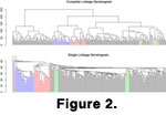 To expand our consideration from one explanatory and one response variable to 31 explanatory and one response is not trivial. Perhaps the simplest solution is the reduction of all 31 explanatory variables to a single distance metric. Clustering the available 245 floras hierarchically shows imperfect clustering by study (the
"blocks" of color) in
Figure 2, which shows dendrograms produced by an agglomerative hierarchical algorithm using the Euclidean distance metric under two clustering procedures (single-linkage and complete linkage), with different properties. (Single linkage clustering finds
"spherical" clusters of objects in n-space; complete linkage finds strings of closely-connected objects.)
To expand our consideration from one explanatory and one response variable to 31 explanatory and one response is not trivial. Perhaps the simplest solution is the reduction of all 31 explanatory variables to a single distance metric. Clustering the available 245 floras hierarchically shows imperfect clustering by study (the
"blocks" of color) in
Figure 2, which shows dendrograms produced by an agglomerative hierarchical algorithm using the Euclidean distance metric under two clustering procedures (single-linkage and complete linkage), with different properties. (Single linkage clustering finds
"spherical" clusters of objects in n-space; complete linkage finds strings of closely-connected objects.)
With a few exceptions (e.g.,
Traiser 2004) such clustering procedures have not been used extensively in leaf physiognomy, perhaps because they produce no explicit models or quantitative estimates of independent variables, but merely give a visual display of similarities among floras. From such a display, we can nevertheless qualitatively conclude that the studies do cluster together, but not without noise.
Much more prevalent—perhaps even ubiquitous among explicit considerations of CLAMP data—are eigenvector techniques for rotating multivariate vector spaces and re-projecting data along a few major axes of variation. The simplest and most general of these is principle components analysis (PCA). Originally
Wolfe (1993) relied on correspondence analysis, and then (in
1995) switched to canonical correspondence analysis, or CCA (Ter Braak 1986). Both methods were specifically designed for comparison of environmental data with species distributions and have become fashionable in community ecology.
Ter Braak (1986) makes it very clear, however, that:
The rationale of the technique [CCA] is derived from a species packing model wherein species are assumed to have Gaussian (bell-shaped) response surfaces with respect to compound environmental gradients.
Ter Braak 1986,
p. 1168
and that
The vital assumption is that the response surfaces of the species are unimodal, the Gaussian (bell-shaped) response model being the example for which the methods performance is particularly good. For the simpler case where species-environment relationships are monotone, the results can still be expected to be adequate in a qualitative sense....The method would not work if a large number of species were distributed in a more complex way, e.g., bimodally.
Ter Braak 1986,
p. 1177
There are a priori reasons to expect species to have unimodal or linear distributions along envirnomental
gradients, but this logic does not necessarily hold for morphological variables
like the proportion of leaves with attenuate apexes. As can be seen from the
pairs plots presented below, some of these relationships between morphological variables and temperature are arched or parabolic. Therefore the theoretical applicability of CCA to morphological variables averaged over floras on a continental or global scale is highly questionable. Like many other statistical methods, CCA is also vulnerable to non-linearity and multiple colinearity:
When the data are collected over a sufficient habitat range for species to show nonlinear, nonmonotonic relationships with environmental variables, it is inappropriate to summarize these relationships by correlation coefficients or to analysis the data by techniques that are based on correlation coefficients, such as canonical correlation analysis.
Ter Braak 1986,
p. 1167
and
When the environmental variables are strongly correlated with each other—for example, simply because the number of environmental variables approaches the number of sites—the effects of different environmental variables on community composition cannot be separated out and, consequently, the canonical coefficients are unstable. This is the multicollinearity problem.
Ter Braak 1986,
p. 1170f.
Many statistical procedures—including simple linear regression—work in practice even when their assumptions are unrealistic, so this alone would not invalidate the application of CCA to CLAMP data. The argument made here is not that CCA produces incorrect results, but merely that the ubiquitous application of it to CLAMP data may be evidence of excessive analytical rigidity.
 Most publications explicitly using CLAMP have followed Wolfe's lead even to the point of using Excel spreadsheet macros in the files that can be downloaded from the CLAMP website and a commercial program called CANOCO (Lep and
Milauer 2003) specifically designed to perform CCA. In fact CCA is now available in many general-purpose statistical packages, including three different implementations for R, and therefore continued reliance on compiled, proprietary software seems additional evidence of methodological canalization. As
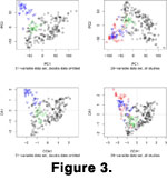
Figure 3 illustrates, moreover, the analysis of CLAMP data is not a case in which PCA and CCA produce significantly different results: the top two bivariate plots are principle components; the bottom two are canonical correspondence axes.
Most publications explicitly using CLAMP have followed Wolfe's lead even to the point of using Excel spreadsheet macros in the files that can be downloaded from the CLAMP website and a commercial program called CANOCO (Lep and
Milauer 2003) specifically designed to perform CCA. In fact CCA is now available in many general-purpose statistical packages, including three different implementations for R, and therefore continued reliance on compiled, proprietary software seems additional evidence of methodological canalization. As
Figure 3 illustrates, moreover, the analysis of CLAMP data is not a case in which PCA and CCA produce significantly different results: the top two bivariate plots are principle components; the bottom two are canonical correspondence axes.
Note how in the upper left quadrant of Figure 3, the bivariate plot of the first two principle components clearly discriminates kowalski from the other two studies. When jacobs is added, however, (the upper right quadrant of
Figure 3) the gap seems much less distinct. This illustrates how sensitive this form of analysis is to sampling. The more data that are added, the harder it is to discriminate clusters that looked distinct when there were fewer points. Although only PCA and CCA have been tested, it is difficult to imagine a realistic situation in which other related eigenvector methods would lead to radically different interpretations of CLAMP data, although they may—like PCA and CCA—differ in the exact values they produce.
Both in the case of hierarchical cluster analysis and eigenvector analysis, it is apparent that the study effect contributes some structure to the data but by no means determines them. Formally, we could also use the multivariate t test (Hotelling's T2) to check the pair-wise null hypotheses of multivariate equivalence of means. In all 4-chose-2 = 6 cases we are forced to reject the null with p-values less than 10-6. In simple terms, the studies could not possibly all be equivalent. Note that the Hotelling code (see
data archive) can not deal with missing values, so the number of variables had to be reduced to 29 in the three cases out of the six pair-wise comparisons where variables were missing. Whatever the statistical logic, the data are clearly affected by the source from which they were obtained, though it cannot be determined with the available information whether this is due to the studies being in different geographic regions or whether people actually code leaves differently.
A dendrogram reduces 31 variables to a single distance metric, eigenvector methods reduce 31 variables to a few principle components, of which two are shown in
Figure 3. What about the remainder of the variables? One response is: the first two principle components account for a large proportion of the variance, so the other variables do not matter much. This seems to be a limited way of looking at the process of data analysis: if only the axes of maximum variance are of interest, then why collect multivariate data? Multivariate data are often collected to answer more than one question, and a variable that answers a particular question (like the presence of teeth answering questions about temperature) may say nothing about another question (regarding, for instance, plant growth form). To choose variables exclusively from mathematical criteria like variance maximization seems to abdicate the responsibility for interpreting results biologically.
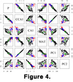 One way of looking at more variables is called a scatter plot matrix (SPLOM;
Basford and Tukey 1999) or, more simply, a pairs plot.
Figure 4 shows all the pairwise relationships between the original two variables plotted in
Figure 1 (P and MAT), the first two principle components (PC1 and PC2), the first canonical component (CA1, the primary axis corresponding to the matrix of sites), and the first constrained canonical component (CCA1, the primary axis corresponding to the environmental matrix).
One way of looking at more variables is called a scatter plot matrix (SPLOM;
Basford and Tukey 1999) or, more simply, a pairs plot.
Figure 4 shows all the pairwise relationships between the original two variables plotted in
Figure 1 (P and MAT), the first two principle components (PC1 and PC2), the first canonical component (CA1, the primary axis corresponding to the matrix of sites), and the first constrained canonical component (CCA1, the primary axis corresponding to the environmental matrix).
As can be seen, a pairs plot allows the plotting of a very large number of multivariate data in a compact form. The question then arises: what is the value added by eigenvector methods of data reduction if it is possible to plot and examine the raw data themselves? In
Figure 5, all the 31 explanatory variables and MAT are presented in this pairwise fashion, with additional details as described in the figure caption.
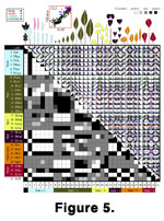 This is a very concentrated way of presenting data; it plots 32 x 245 = 7840 two-digit numbers, the equivalent in characters of about twelve and a half manuscript pages of text. Each of the small plots above the matrix diagonal is a similar bivariate plot showing the relationship between two of the 32 variables. Thus the scatter plot in the 32nd column and 2nd row of the pairs plot is a reduced version of
Figure 1; it is simply the bivariate plot of P against MAT. The second and 32nd of the diagonal cells also correspond to the marginal histograms in
Figure 1. The shadings below the diagonal are obtained by performing four two-sided hypothesis tests for each cell:
This is a very concentrated way of presenting data; it plots 32 x 245 = 7840 two-digit numbers, the equivalent in characters of about twelve and a half manuscript pages of text. Each of the small plots above the matrix diagonal is a similar bivariate plot showing the relationship between two of the 32 variables. Thus the scatter plot in the 32nd column and 2nd row of the pairs plot is a reduced version of
Figure 1; it is simply the bivariate plot of P against MAT. The second and 32nd of the diagonal cells also correspond to the marginal histograms in
Figure 1. The shadings below the diagonal are obtained by performing four two-sided hypothesis tests for each cell:
H0: slope of the least squares regression line = 0
H0: Pearson's product-moment correlation coefficient = 0
H0: Spearman's rank order correlation coefficient = 0
H0: Kendall's rank order correlation coefficient = 0
In each case the alternative hypothesis is the equivalent inequality.
The cell is colored white if the mean of the three correlation coefficients is positive and if all tests reject; black if the mean of the three correlation coefficients is negative and all tests reject; and medium grey if all tests fail to reject. If some but not all of the tests reject, the cell is colored light grey or dark grey depending on the sign of the mean of the correlations of the tests that are significant. In all cases the color of the text is black if the mean of the three correlation coefficients is positive and white otherwise. All tests are made at the level [ = 0.05 / number of comparisons, where the number of comparisons is (number of variables) * (number of variables - 1) / 2, i.e., the 5% level with Bonferroni correction for multiple comparisons.
This representation of the data allows us to examine complex multiple-covariation among the explanatory variables in detail. For instance, compare the second column with the third-through-seventh column block. They are inverses of each other, as they must be, because the second column represents the percentage of species lacking teeth and the third-through-seventh columns give the percentage of species with particular types of teeth. Another interesting block of covarying values is provided by the leaf sizes: columns and rows 8 through 18. Here, the smallest four leaf size categories are all strongly positively correlated with each other as are the largest four leaf size categories, while there is a strong negative correlation between the small and large blocks. Only the middle three size categories are not strongly collinear. Graphical display of this sort of data makes the strong covariation among the variables apparent and indicates that any statistics calculated from them that assume independence should be treated with caution.
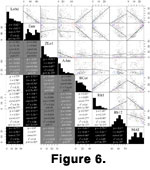 At such a small scale, it can be difficult to see details of the scatter plots, so
Figure 6 shows another pairs' plot of a subset of the variables.
At such a small scale, it can be difficult to see details of the scatter plots, so
Figure 6 shows another pairs' plot of a subset of the variables.
In this plot, in addition to the scatter plot matrix above the diagonal, the numbers in the blocks below the diagonal give all of the pairwise correlation coefficients (the two common non-parametric correlation coefficients, Spearman's
 and Kendall's
  as well as the ordinary product-moment correlation coefficient) and the r2 and p-values for the least-squares fitted line.
This reduced set of variables could have been selected by a stepwise multiple regression procedure with formal rules for adding or subtracting variables from a model based on information criteria. This has been done and it is easy to produce models in which all terms are significant, with r2 as high as 0.8 and p < 10-16. Since there are several such stepwise techniques, all of which produce about the same quality of model from different variables, there is no reason to choose one model over another, and the variables for this smaller plot were selected based on their perceived interest instead of on a formal stepwise procedure.
This particular choice of explanatory variables happens to produce a multiple linear least-squares model for MAT with of 0.86 and p < 10-16; adding a factor to the model showing which study each observation came from as an additional explanatory variable increases the r2 significantly to 0.88.
These models could still be improved further by continued analysis (for instance, interactions, non-linear terms, and variable transformations were not even tried). It does not seem valuable, however, to spend time massaging a model until the issues that the univariate case brought up (like incomparability of studies) are taken care of.
